Wednesday, 15 January 2014

Webpage Layouts

These are the 4 webpage layout I have designed
The 1 below is a basic layout, it has the logo and banner at the top, buttons on the side with ads below them and the main page to the right.
Has the logo and buttons at the top of the page with panels to the left, some could be used for describing and leading to other related sites or perhaps being space for ads.
A more unique layout, has the banner at the top, buttons and ads on the left overlaying the webpage.
A webpage which almost resembles a floppy disc. Has the logo at the top left with the buttons revolving around it, a cool interactive feature could be for the buttons to spread out as the users cursor goes over the first button.
This is the website layout I have chosen thus far, a fairy simple site with a blue and white design.

Monday, 6 January 2014

GIF

I have made a GIF in Photoshop.
I used a Digital SLR to take multiple shots consecutively.
Once the taken images were uploaded to the computer, I imported them into a 600 x 400 pixel document and using the Timeline (Located at the bottom of Photoshop CS6s Essential layout) made them display one after another.

Wednesday, 20 November 2013

Android App

I have mostly finished my App using an online program called "MIT App inventor".
The game starts with a screen which instructs the play to touch it, upon doing so the actual game itself will start. The objective of the game is to move the blue sensor to all the lit up green sensors and press the green button in the middle of the screen, avoiding all the sensors to light up green, if they do the game will be over.
The only things I feel I need to do is, add a restart button, a how to play tab in the main menu, change the up and down arrows into curvy arrows which will show the direction it will rotate and a penalty for clicking on red sensors (Probably reduce the time until the next sensor appears).


Wednesday, 9 October 2013

App pitch

Today I showed my pitch for my new app game idea in a focus group.

The App
I will first explain my original idea of the game.
It involved having to use the rotation feature on the device to match up two bars, which once match you would have to press a green button in the center of the screen while keeping the bars in same position to complete the stage/level. You have 60 seconds to do as many stages/levels as you can with the difficulty rising as the game starts throwing in effects which will make the game harder to play. Things such as making the center button and bars smaller, giving the wheel an illusive effect which will disorientate the player and in higher stages use more mentally challenging tricks such as flipping the screen, forcing the player to play backwards or upside down.

The Pitch
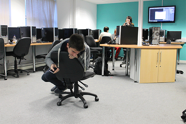
I got many ideas, suggestions, complaints and more about the game.
1 of the first ideas given was if later in the game there would be multiple bars to match up. This would be an interesting idea it but would require me to add another feature to the game, being able to select which bar you want to move which could simply be done by tapping onto the bar.
1 complaint I had was that the splash screen did not look natural or smooth like the photo on the left and was hard to read. While most of the graphics weren't final it was still good feedback.
2 people mentioned that the game could be themed to look like a lock cracking scene which was 1 of the thoughts I had before showing the pitch so it shows the idea was commonly thought. Knowing that people liked the lock idea I think it may be a good idea once I redesign it to call the game something more fitting such as "Lock Break".

Monday, 7 October 2013

Logo

Today I finished creating my logo for my (fictional) company "Adams Trade".
To make the unique shape in the middle I put a letter T which I made myself by distorting and editing a capital letter T above the letter A which was also made through editing.
I then put a circle above the T to make it look like a person/stick figure however it didn't look so appealing standing upright so I decided rotating it would be a good idea. I used rulers to line up everything dead centre of the square I made to have the black text have a white background making it stand out even more.
Once I was done with the square and text, the top left of the square seemed a bit empty to me so I decided to add a quarter circle to fill in the space while looking interesting.
The main thing objective I gave myself while making the logo was to make it bold and interesting yet simple.
The only colours used are black and white which together stand out and are hard to dislike as they are not colours. Most big sites have white backgrounds, such as Google, YouTube, Ebay, Amazon and etc.